Extensible Blade Components


HTML is wonderful, right? What would we do without it? But anyone who's written HTML without a templating system knows how much of it is just chunks of code copied and pasted from file to file.
Modern templating systems, like Laravel's Blade templates, try to fix this problem by reducing the need for duplication. Template inheritance, includes, and loops all help, but in the end, many Blade templates still feel like they're full of chunks of code copied and pasted from file to file.
As wonderful as utility-first CSS frameworks like Tailwind CSS are, they too increase this feeling. I love Tailwind, but even its authors acknowledge that the end result is, well, ugly. Their suggestion for solving the problem is to extract components for common elements. When I hear "components", my mind immediately jumps to JavaScript components in libraries like React or Vue, but we actually have a very similar concept in Laravel via Blade Components. Blade components are a great way to cut down on error-prone copy/pasting and hide away implementation details like long lists of CSS classes.
In this post, we'll first talk about the foundations of Blade components. Then, we'll walk through the process of creating an extensible button component that contains the code common between button types. The component will allow for two distinct visual representations, can be rendered as an anchor or a button, and will have light interactivity provided by Alpine.
Overview of Blade Components
Before we talk about extensible Blade components, let's take a brief look at Blade components themselves. This overview covers the basics, and I encourage you to dive deeper via the via the documentation in the future.
If you have previous experience with Laravel Blade components and want to skip to the extensible part, jump down to Diving In
Types of Components
A Blade component can be created in a few different ways:
- Class-based, which has a class that lives in
app/View/Components/and a template inresources/views/components/ - Inline, which is like class-based but contains a
rendermethod that returns the component's markup instead of a template in theresourcesdirectory - Anonymous, which has the component template in
resources/views/components/but no class backing it
Throughout this post, I'll be using anonymous Blade components. You can get the same results with class-based components; I personally prefer to have template-specific code within the resources/views directory for simplicity.
Rendering Blade Components
Blade components are rendered in templates using <x- syntax. In our case, we will be making a button component, so the simplest usage would look something like this:
<!-- in a template -->
<x-button></x-button>

<!-- resources/views/components/button.blade.php -->
<button></button>
Props and Attributes
We pass data to our components through HTML attributes; attributes containing PHP expressions and variables need to be prefixed with ::
<x-button type="reset" :text="$text"></x-button>
Within the component, the provided attributes will be available in the component's attribute bag, but you can define the attributes that should be used as data variables in a @props directive, which also provides the opportunity to set default values:
@props([
  // defaults to "submit"; in the example above, would be "reset"
  'type' => 'submit',
  // no default, which means it *must* be passed in
  'text',
])
For class-based components, these props would be defined in the component's constructor.
The attribute bag mentioned above has some very interesting methods that you can browse in the
Illuminate\View\ComponentAttributeBagclass.
Any attributes, not defined in the @props directive within the component, will be available to the component via {{ $attributes }}. This works great for HTML attributes that should be applied to the root element.
For example, if our component is structured like so:
@props([
  'type' => 'submit',
  'text',
])

<button type="{{ $type }}" {{ $attributes }}>{{ $text }}</button>
And was called in this manner where $text = 'Reset Form':
<x-button type="reset" class="ml-3" :text="$text"></x-button>
Then the generated markup would look like this:
<button type="reset" class="ml-3">Reset Form</button>
The default value (submit) of the type property was overwritten by the passed value reset, the text property was rendered inside the button, and the class attribute (not defined as a prop) was rendered via {{ $attributes }}.
Slots
Slots are similar to props, in that they allow you to pass content into a component. But unlike props, which are passed via HTML attributes, slots are passed as any content within an opening and closing HTML tag, which means you can easily pass entire chunks of HTML into a component using slots.
For example, the text attribute we used previously can instead be passed in a slot by adding content between the opening and closing tags of the component. The component can render the provided content with {{ $slot }}:
<!-- button.blade.php  -->
<!-- component now uses $slot instead of $text -->
<button type="submit" {{ $attributes }}>{{ $slot }}</button>

<!-- welcome.blade.php -->
<!-- place the HTML inside of the component tags, i.e. "the slot" -->
<x-button type="submit" class="ml-3">Hello there</x-button>

<!-- and the output to the browser is the same -->
<button type="submit" class="ml-3">Hello there</button>
You can also add more than one slot to a component using a feature called "named slots", which we'll talk more about later.
Diving In
Now that we've covered a basic introduction to components, let's dive into how to create your Blade components to be extensible and to avoid duplication.
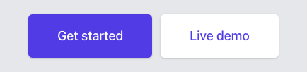
For this example, we'll be using Tailwind CSS and a couple of buttons that were modified from examples in their docs:
I'll be starting with a fresh Laravel application with Tailwind, installed via a CDN, and working within the welcome.blade.php view.
Let's get started by updating welcome.blade.php with the HTML copied from Tailwind UI:
<!-- /resources/views/welcome.blade.php -->

<!-- in <head> -->
<script src="https://cdn.tailwindcss.com"></script>

<!-- body -->
<body class="antialiased bg-gray-200">
  <div class="mx-auto mt-5 max-w-md sm:flex sm:justify-center md:mt-8">
    <div class="rounded-md shadow">
      <a
        href="#"
        class="flex w-full items-center justify-center rounded-md border border-transparent bg-indigo-600 px-8 py-3 text-base font-medium text-white hover:bg-indigo-700 md:py-4 md:px-10 md:text-lg"
      >
        Get started
      </a>
    </div>
    <div class="mt-3 rounded-md shadow sm:mt-0 sm:ml-3">
      <a
        href="#"
        class="flex w-full items-center justify-center rounded-md border border-transparent bg-white px-8 py-3 text-base font-medium text-indigo-600 hover:bg-gray-50 md:py-4 md:px-10 md:text-lg"
      >
        Live demo
      </a>
    </div>
  </div>
</body>
In the HTML above, we can see that the two buttons have a lot of classes applied to them. These buttons are a good example of something that can be usefully extracted to a component since there is a good chance this code will get copied and pasted throughout the application as time goes on.
Creating the Initial Components
We'll start by extracting the first button to a component and move on to variations next.
Components live in the resources/views/components/ directory, so let's create a new file in that directory, button.blade.php, and cut and paste the HTML for the first button from our welcome view into it. Since the button text and href will need to be dynamic, we will pass the data in through attributes and a slot.
Now, the new button.blade.php file should look like this:
<!-- /resources/views/components/button.blade.php -->

<div class="rounded-md shadow">
  <a
    href="{{ $href }}"
    class="flex w-full items-center justify-center rounded-md border border-transparent bg-indigo-600 px-8 py-3 text-base font-medium text-white hover:bg-indigo-700 md:py-4 md:px-10 md:text-lg"
  >
    {{ $slot }}
  </a>
</div>
While our welcome view, welcome.blade.php, should look like this:
  <!-- /resources/views/welcome.blade.php -->

  <div class="mx-auto mt-5 max-w-md sm:flex sm:justify-center md:mt-8">
     <div class="rounded-md shadow"><!-- [tl! remove:7] -->
      <a
        href="#"
        class="flex w-full items-center justify-center rounded-md border border-transparent bg-indigo-600 px-8 py-3 text-base font-medium text-white hover:bg-indigo-700 md:py-4 md:px-10 md:text-lg"
      >
        Get started
      </a>
     </div>
    <x-button href="#">Get started</x-button><!-- [tl! add] -->
    <div class="mt-3 rounded-md shadow sm:mt-0 sm:ml-3">
      <a
        href="#"
        class="flex w-full items-center justify-center rounded-md border border-transparent bg-white px-8 py-3 text-base font-medium text-indigo-600 hover:bg-gray-50 md:py-4 md:px-10 md:text-lg"
      >
        Live demo
      </a>
    </div>
  </div>
A refresh of the browser shows that nothing has changed visually. Great! We've successfully created a simple blade component. Let's dive deeper.
Button Variations
You might be thinking ahead and wondering how this will work for the second button since we've copied styles for the first button directly into the new component. You'd be right to do so; it won't work in this current state. So let's fix that.
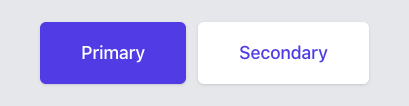
For clarity, let's call the button on the left with the purple background "primary", and the button on the right "secondary".
Let's create dedicated components for each. First, we'll change the button component we made to be called primary, then extract the secondary button using the same method as before. We can accomplish the first part with the following steps:
- Create a new directory,
resources/views/components/button/ - Rename our original button component to
primary.blade.php, and move it into the newly created directory - Components in sub-directories are referenced using dot-notation so change
<x-button>Get Started</x-button>to<x-button.primary>Get started</x-button.primary>
  <!-- /resources/views/welcome.blade.php -->

  <div class="mx-auto mt-5 max-w-md sm:flex sm:justify-center md:mt-8">
    <x-button href="#">Get started</x-button><!-- [tl! remove] -->
    <x-button.primary href="#">Get started</x-button.primary><!-- [tl! add] -->
    <div class="mt-3 rounded-md shadow sm:mt-0 sm:ml-3">
      <a
        href="#"
        class="flex w-full items-center justify-center rounded-md border border-transparent bg-white px-8 py-3 text-base font-medium text-indigo-600 hover:bg-gray-50 md:py-4 md:px-10 md:text-lg"
      >
        Live demo
      </a>
    </div>
  </div>
Now let's create the secondary button component in the same manner as the first.
The result should be a new component, resources/views/components/button/secondary.blade.php, with the following contents:
<!-- /resources/views/components/button/secondary.blade.php -->

<div class="mt-3 rounded-md shadow sm:mt-0 sm:ml-3">
  <a
    href="{{ $href }}"
    class="flex w-full items-center justify-center rounded-md border border-transparent bg-white px-8 py-3 text-base font-medium text-indigo-600 hover:bg-gray-50 md:py-4 md:px-10 md:text-lg"
  >
    {{ $slot }}
  </a>
</div>
And our welcome view will now look like this:
  <!-- /resources/views/welcome.blade.php -->

  <div class="mx-auto mt-5 max-w-md sm:flex sm:justify-center md:mt-8">
    <x-button.primary href="#">Get started</x-button.primary>
    <div class="mt-3 rounded-md shadow sm:mt-0 sm:ml-3"><!-- [tl! remove:7] -->
      <a
        href="#"
        class="flex w-full items-center justify-center rounded-md border border-transparent bg-white px-8 py-3 text-base font-medium text-indigo-600 hover:bg-gray-50 md:py-4 md:px-10 md:text-lg"
      >
        Live demo
      </a>
    </div>
    <x-button.secondary href="#">Live demo</x-button.secondary><!-- [tl! add] -->
  </div>
Refreshing the page will show that nothing has changed visually, but we can see the code in the welcome view is a lot nicer to look at, and we have two components that we can easily use elsewhere in our app.
There is a problem, though: we've included the mt-3 sm:mt-0 sm:ml-3 classes, which add margin the button, into our secondary button component when we copied and pasted it. Now margin will be added every time we use the component. Let's instead have the calling template pass this information to the components when needed.
- Remove
mt-3 sm:mt-0 sm:ml-3from the class list in the secondary button component file - Add
class="mt-3 sm:mt-0 sm:ml-3"to the secondary button in our welcome view - Update both components to merge the classes provided in the component with the classes that were defined in the template, by adding the following to our wrapping divs:
<div {{ $attributes->merge(['class' => 'rounded-md shadow']) }}>
Now our welcome view should look like this:
   <!-- /resources/views/welcome.blade.php -->

   <div class="mx-auto mt-5 max-w-md sm:flex sm:justify-center md:mt-8">
     <x-button.primary href="#">Get started</x-button.primary>
     <x-button.secondary href="#">Live demo</x-button.secondary><!-- [tl! remove] -->
     <x-button.secondary
       class="mt-3 sm:mt-0 sm:ml-3"
       href="#"
     >
       Live demo
     </x-button.secondary><!-- [tl! add:-5] -->
   </div>
Our primary button should look like this:
    <!-- /resources/views/components/button/primary.blade.php -->

    <div class="rounded-md shadow"><!-- [tl! remove] -->
    <div {{ $attributes->merge(['class' => 'rounded-md shadow']) }}><!-- [tl! add] -->
      <a
        href="{{ $href }}"
        class="flex w-full items-center justify-center rounded-md border border-transparent bg-indigo-600 px-8 py-3 text-base font-medium text-white hover:bg-indigo-700 md:py-4 md:px-10 md:text-lg"
        >
          {{ $slot }}
      </a>
    </div>
And our secondary button should look like this:
    <!-- /resources/views/components/button/secondary.blade.php -->

    <div class="mt-3 rounded-md shadow sm:mt-0 sm:ml-3"><!-- [tl! remove] -->
    <div {{ $attributes->merge(['class' => 'rounded-md shadow']) }}><!-- [tl! add] -->
      <a
        href="{{ $href }}"
        class="flex w-full items-center justify-center rounded-md border border-transparent bg-white px-8 py-3 text-base font-medium text-indigo-600 hover:bg-gray-50 md:py-4 md:px-10 md:text-lg"
      >
        {{ $slot }}
      </a>
    </div>
Another browser refresh will show that nothing has changed visually, but our components have become independent of the margin added in the welcome view.
Extracting a Base Component
We just made the same change, adding {{ $attributes->merge(...) }} in each button variant. It is easy to imagine needing another variant in the future, so it would be beneficial to be able to write [or duplicate] as little code as possible to get the new button working.
A good way to accomplish this is to extract a base button component that button variants can easily extend. This way future changes that should be applied to all button types, like font size or internal padding, need only be changed in the base component.
Comparing the primary and secondary buttons we can see that the colors are different:
- Primary button:
bg-indigo-600 text-white hover:bg-indigo-700 - Secondary button:
bg-white text-indigo-600 hover:bg-gray-50
But the other classes are the same:
w-full flex items-center justify-center px-8 py-3 border border-transparent text-base font-medium rounded-md md:py-4 md:text-lg md:px-10
This means that these classes, along with the duplicate HTML, can be moved to a base component. We can accomplish this using an anonymous index component.
Let's work through this process in the same method we took earlier, focusing on the primary button and then circling back to the secondary button.
First, create a new file in our resources/views/components/button/ directory named index.blade.php which will hold the common elements between the buttons. Next, copy and paste the contents of the primary button into the index file:
<!-- /resources/views/components/button/index.blade.php -->

<div {{ $attributes->merge(['class' => 'rounded-md shadow']) }}>
  <a
    href="{{ $href }}"
    class="flex w-full items-center justify-center rounded-md border border-transparent bg-indigo-600 px-8 py-3 text-base font-medium text-white hover:bg-indigo-700 md:py-4 md:px-10 md:text-lg"
  >
    {{ $slot }}
  </a>
</div>
Then call the base button from the primary button component, passing down the attributes to it:
   <!-- /resources/views/components/button/primary.blade.php -->

   <div {{ $attributes->merge(['class' => 'rounded-md shadow']) }}><!-- [tl! remove:7] -->
     <a
       href="{{ $href }}"
       class="flex w-full items-center justify-center rounded-md border border-transparent bg-indigo-600 px-8 py-3 text-base font-medium text-white hover:bg-indigo-700 md:py-4 md:px-10 md:text-lg"
     >
       {{ $slot }}
     </a>
   </div>
   <x-button {{ $attributes }}><!-- [tl! add:2] -->
     {{ $slot }}
   </x-button>
Now let's remove the classes we identified as being different between both primary and secondary buttons from the index component, and pass them in from the primary component. One thing to note is that the classes that we will be merging in are not on the top-level div but on the a tag so we can't simply use {{ $attributes }} as we did before. To solve for this we will pass down a prop containing the classes that will be added to the a tag.
First, we'll add the @props directive to the index component and add buttonClasses to it:
   <!-- /resources/views/components/button/index.blade.php -->

   @props(['buttonClasses'])<!-- [tl! add] -->

   <div {{ $attributes->merge(['class' => 'rounded-md shadow']) }}>
     <a
      href="{{ $href }}"
      class="flex w-full items-center justify-center rounded-md border border-transparent bg-indigo-600 px-8 py-3 text-base font-medium text-white hover:bg-indigo-700 md:py-4 md:px-10 md:text-lg"
    >
       {{ $slot }}
     </a>
   </div>
Then we will remove the unique classes that are in the index component, pass them from the primary component using the new prop, and render them in the class attribute.
Now the index component should look like this:
   <!-- /resources/views/components/button/index.blade.php -->

   @props(['buttonClasses'])

   <div {{ $attributes->merge(['class' => 'rounded-md shadow']) }}>
     <a
       href="{{ $href }}"
       class="flex w-full items-center justify-center rounded-md border border-transparent bg-indigo-600 px-8 py-3 text-base font-medium text-white hover:bg-indigo-700 md:py-4 md:px-10 md:text-lg"
     ><!-- [tl! remove:-3] -->
     <a
       href="{{ $href }}"
       class="{{ $buttonClasses }} w-full flex items-center justify-center px-8 py-3 border border-transparent text-base font-medium rounded-md md:py-4 md:text-lg md:px-10"
     ><!-- [tl! add:-3] -->
       {{ $slot }}
     </a>
   </div>
And the primary component should look like this:
   <!-- /resources/views/components/button/primary.blade.php -->

   <x-button {{ $attributes }}><!-- [tl! remove] -->
   <x-button
     {{ $attributes }}
     button-classes="bg-indigo-600 text-white hover:bg-indigo-700"
   ><!-- [tl! add:-3] -->
     {{ $slot }}
   </x-button>
There is one final change to make before the welcome view will load without error. Currently, $href is unavailable to the index component. Let's fix that by adding it to the @props directive:
   <!-- /resources/views/components/button/index.blade.php -->
   <!-- [tl! add:2,1] -->
   @props([
     'href',
     'buttonClasses',
   ])
Now a refresh of the welcome view will show that nothing has changed visually but we're able to utilize an index component as a base for our buttons. Let's repeat the changes for the secondary button.
After the changes the secondary button component should look like this:
    <!-- /resources/views/components/button/secondary.blade.php -->

    <div {{ $attributes->merge(['class' => 'rounded-md shadow']) }}><!-- [tl! remove:4] -->
      <a href="{{ $href }}" class="flex w-full items-center justify-center rounded-md border border-transparent bg-white px-8 py-3 text-base font-medium text-indigo-600 hover:bg-gray-50 md:py-4 md:px-10 md:text-lg">
        {{ $slot }}
      </a>
    </div>

    <x-button
      {{ $attributes }}
      button-classes="bg-white text-indigo-600 hover:bg-gray-50"
    >
      {{ $slot }}
    </x-button><!-- [tl! add:-5] -->
Now adding new button types or adjusting buttons throughout the application, such as text size or internal padding, can easily be made in one place and reflect everywhere.
Making the Component More Useful
Let's expand the utility of these components by allowing them to not only render as an anchor element, but also as a button element that can submit or reset forms, as well as confirm a user wants to navigate away from the page.
Button Types
Let's first allow the component to be rendered as either an anchor or a submit button before tackling user confirmation. To get ready, hop into the welcome view and change the primary button's href to a real URL, remove the href attribute from the secondary button, and add type="submit" to the secondary button so we can test out our changes in the browser.
The changes to our welcome view should look like this:
   <!-- /resources/views/welcome.blade.php -->

   <x-button.primary href="#">Get started</x-button.primary><!-- [tl! remove:6] -->
   <x-button.secondary
     class="mt-3 sm:mt-0 sm:ml-3"
     href="#"
   >
     Live demo
   </x-button.secondary>

   <x-button.primary href="https://google.com">Get started</x-button.primary><!-- [tl! add:6] -->
   <x-button.secondary
     class="mt-3 sm:mt-0 sm:ml-3"
     type="submit"
   >
     Live demo
   </x-button.secondary>
Next, let's add type to our props and default it to button in our index component:
   <!-- /resources/views/components/button/index.blade.php -->
   <!-- [tl! add:3,1] -->
   @props([
     'href',
     'type' => 'button',
     'buttonClasses',
   ])
Now, let's add a conditional to our index component to determine which element it should render by checking if $href is set. If href is present, then we will render an anchor; otherwise, we will render a button:
   <!-- /resources/views/components/button/index.blade.php -->
   <!-- [tl! remove:1,6] -->
   <a
     href="{{ $href }}"
     class="{{ $buttonClasses }} w-full flex items-center justify-center px-8 py-3 border border-transparent text-base font-medium rounded-md md:py-4 md:text-lg md:px-10"
   >
     {{ $slot }}
   </a>

   @isset ($href)<!-- [tl! add:start] -->
     <a
       href="{{ $href }}"
       class="{{ $buttonClasses }} w-full flex items-center justify-center px-8 py-3 border border-transparent text-base font-medium rounded-md md:py-4 md:text-lg md:px-10"
     >
       {{ $slot }}
     </a>
   @else
     <button
       type="{{ $type }}"
       class="{{ $buttonClasses }} w-full flex items-center justify-center px-8 py-3 border border-transparent text-base font-medium rounded-md md:py-4 md:text-lg md:px-10"
     >
       {{ $slot }}
     </button>
   @endisset<!-- [tl! add:end] -->
Refreshing and inspecting the rendered elements on the page should show that the primary button is rendering as an anchor and the secondary button is rendering as a button.
Let's take a short detour to apply a small clean-up. Since the classes in the index component are the same for the anchor and button we can reduce that duplication by modifying our props directive to contain our entire class string:
   <!-- /resources/views/components/button/index.blade.php -->
   <!-- [tl! add:5,1] -->
   @props([
     'href',
     'type' => 'button',
     'buttonClasses',
     'classes' => $buttonClasses . ' w-full flex items-center justify-center px-8 py-3 border border-transparent text-base font-medium rounded-md md:py-4 md:text-lg md:px-10',
   ])

   <div {{ $attributes->merge(['class' => 'rounded-md shadow']) }}>
     @isset ($href)<!-- [tl! remove:3,1 add:4,1] -->
       <a
         href="{{ $href }}"
         class="{{ $buttonClasses }} w-full flex items-center justify-center px-8 py-3 border border-transparent text-base font-medium rounded-md md:py-4 md:text-lg md:px-10"
         class="{{ $classes }}"
       >
         {{ $slot }}
       </a>
     @else <!-- [tl! remove:3,1 add:4,1] -->
       <button
         type="{{ $type }}"
         class="{{ $buttonClasses }} w-full flex items-center justify-center px-8 py-3 border border-transparent text-base font-medium rounded-md md:py-4 md:text-lg md:px-10"
         class="{{ $classes }}"
       >
         {{ $slot }}
       </button>
     @endisset
   </div>
I think that is a little easier to look at. Let's continue.
Adding JavaScript
We are going to talk about named slots next, but before we do, I want to illustrate a nicety that we have provided ourselves now that we have created this button component. We have a place to add functionality that can be used elsewhere on the site. Let's add the ability to have users confirm they want to navigate away when clicking a button link.
Let's use Alpine to handle the click event. First, we need to add Alpine to the application. Alpine can be installed through npm or by adding a script tag to <head>. The latter is easier for our example, so let's do that:
   <!-- /resources/views/welcome.blade.php -->
   <!-- inside of <head> -->

   <script src="https://cdn.tailwindcss.com"></script>
   <script defer src="//unpkg.com/alpinejs@3.x.x/dist/cdn.min.js"></script><!-- [tl! add] -->
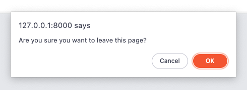
Let's set an attribute called confirmation that contains the message that should be displayed to the user:
    <!-- /resources/views/welcome.blade.php -->
    <!-- [tl! add:3,1] -->
    <x-button.primary
      href="https://google.com"
      confirmation="Are you sure you want to leave this page?"
    >
      Get started
    </x-button.primary>
Next, in our base component, we'll add confirmation to our props array and write the code that will display the confirmation message if it is provided:
   <!-- /resources/views/components/button/index.blade.php -->
   <!-- [tl! add:2,1] -->
   @props([
     'confirmation'
     'href',
     'type' => 'button',
     'buttonClasses',
     'classes' => $buttonClasses . ' w-full flex items-center justify-center px-8 py-3 border border-transparent text-base font-medium rounded-md md:py-4 md:text-lg md:px-10',
   ])

   <div {{ $attributes->merge(['class' => 'rounded-md shadow']) }}>
     @isset ($href) <!-- [tl! add:4,4] -->
       <a
         href="{{ $href }}"
         class="{{ $classes }}"
         @isset ($confirmation)
           x-data
           @click.prevent="if (confirm('{{ $confirmation }}')) window.location='{{ $href }}';"
         @endisset
       >
         {{ $slot }}
       </a>
     @else
       <button
         type="{{ $type }}"
         class="{{ $classes }}"
       >
         {{ $slot }}
       </button>
     @endisset
   </div>
Note:
x-dataand@click.preventare provided by Alpine.
Now, with a small change in one file, we can configure any link button in our application to have the user to confirm before navigation. This is a simple example but shows a powerful pattern for creating helpful components that need JavaScript but don't require you to pull in a library like React or Vue.
Using Named Slots
Many times you'll need to render additional HTML content in places other than the default {{ $slot }} location. This can be accomplished using named slots. Let's make a change to our buttons to illustrate how named slots work in this context and demonstrate how we can access slots in our index component using @aware.
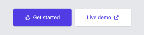
Let's say we wanted our button to be able to render an icon to the left or right of the text:
The icons we are using are
thumb-upandexternal-linkfrom heroicons.
We could accomplish this without changes to our existing button component by adding the icon next to the button text:
  <!-- /resources/views/welcome.blade.php -->

  <x-button.primary
    href="https://google.com"
    confirmation="Are you sure you want to leave this page?"
  >
    <svg xmlns="http://www.w3.org/2000/svg" class="h-5 w-5 mr-2" fill="none" viewBox="0 0 24 24" stroke="currentColor"><!-- [tl! add:2] -->
      <path stroke-linecap="round" stroke-linejoin="round" stroke-width="2" d="M14 10h4.764a2 2 0 011.789 2.894l-3.5 7A2 2 0 0115.263 21h-4.017c-.163 0-.326-.02-.485-.06L7 20m7-10V5a2 2 0 00-2-2h-.095c-.5 0-.905.405-.905.905 0 .714-.211 1.412-.608 2.006L7 11v9m7-10h-2M7 20H5a2 2 0 01-2-2v-6a2 2 0 012-2h2.5"/>
    </svg>
    Get started
  </x-button.primary>
  <x-button.secondary
    class="mt-3 sm:mt-0 sm:ml-3"
    type="submit"
  >
    Live demo
    <svg xmlns="http://www.w3.org/2000/svg" class="h-5 w-5 ml-2" fill="none" viewBox="0 0 24 24" stroke="currentColor"><!-- [tl! add:2] -->
      <path stroke-linecap="round" stroke-linejoin="round" stroke-width="2" d="M10 6H6a2 2 0 00-2 2v10a2 2 0 002 2h10a2 2 0 002-2v-4M14 4h6m0 0v6m0-6L10 14"/>
    </svg>
  </x-button.secondary>
But to illustrate how named slots work, let's pass in the icon via slots named left and right to signify if the icon should render on the left or right of the button text:
  <!-- /resources/views/welcome.blade.php -->

  <x-button.primary
    href="https://google.com"
    confirmation="Are you sure you want to leave this page?"
  >
    <x-slot:left><!-- [tl! add:4] -->
      <svg xmlns="http://www.w3.org/2000/svg" class="h-5 w-5 mr-2" fill="none" viewBox="0 0 24 24" stroke="currentColor">
        <path stroke-linecap="round" stroke-linejoin="round" stroke-width="2" d="M14 10h4.764a2 2 0 011.789 2.894l-3.5 7A2 2 0 0115.263 21h-4.017c-.163 0-.326-.02-.485-.06L7 20m7-10V5a2 2 0 00-2-2h-.095c-.5 0-.905.405-.905.905 0 .714-.211 1.412-.608 2.006L7 11v9m7-10h-2M7 20H5a2 2 0 01-2-2v-6a2 2 0 012-2h2.5"/>
      </svg>
    <x-slot:left>
    <svg xmlns="http://www.w3.org/2000/svg" class="h-5 w-5 mr-2" fill="none" viewBox="0 0 24 24" stroke="currentColor"><!-- [tl! remove:2] -->
      <path stroke-linecap="round" stroke-linejoin="round" stroke-width="2" d="M14 10h4.764a2 2 0 011.789 2.894l-3.5 7A2 2 0 0115.263 21h-4.017c-.163 0-.326-.02-.485-.06L7 20m7-10V5a2 2 0 00-2-2h-.095c-.5 0-.905.405-.905.905 0 .714-.211 1.412-.608 2.006L7 11v9m7-10h-2M7 20H5a2 2 0 01-2-2v-6a2 2 0 012-2h2.5"/>
    </svg>
    Get started
  </x-button.primary>
  <x-button.secondary
    class="mt-3 sm:mt-0 sm:ml-3"
    type="submit"
  >
    <x-slot:right><!-- [tl! add:4] -->
      <svg xmlns="http://www.w3.org/2000/svg" class="h-5 w-5 ml-2" fill="none" viewBox="0 0 24 24" stroke="currentColor">
        <path stroke-linecap="round" stroke-linejoin="round" stroke-width="2" d="M10 6H6a2 2 0 00-2 2v10a2 2 0 002 2h10a2 2 0 002-2v-4M14 4h6m0 0v6m0-6L10 14"/>
      </svg>
    <x-slot:right>
    Live demo
    <svg xmlns="http://www.w3.org/2000/svg" class="h-5 w-5 ml-2" fill="none" viewBox="0 0 24 24" stroke="currentColor"><!-- [tl! remove:2] -->
      <path stroke-linecap="round" stroke-linejoin="round" stroke-width="2" d="M10 6H6a2 2 0 00-2 2v10a2 2 0 002 2h10a2 2 0 002-2v-4M14 4h6m0 0v6m0-6L10 14"/>
    </svg>
  </x-button.secondary>
And we'll render the slots in our index component like so:
  <!-- /resources/views/components/button/index.blade.php -->

  @isset ($href)
    <a
      href="{{ $href }}"
      class="{{ $classes }}"
      @isset ($confirmation)
        x-data
        @click.prevent="if (confirm('{{ $confirmation }}')) window.location='{{ $href }}';"
      @endisset
    >
      {{ $left }}<!-- [tl! add] -->
      {{ $slot }}
      {{ $right }}<!-- [tl! add] -->
    </a>
  @else
    <button
      type="{{ $type }}"
      class="{{ $classes }}"
    >
      {{ $left }}<!-- [tl! add] -->
      {{ $slot }}
      {{ $right }}<!-- [tl! add] -->
    </button>
  @endisset
Refreshing the browser will show an error has occurred: $left (and $right) are undefined. This is because we are passing those slots to the primary and secondary components, but not passing them down to the index component. We can fix this with the @aware directive, which allows access to data in parent components to be accessible to child components. Let's use it by adding the following to the top of the index component:
<!-- /resources/views/components/button/index.blade.php -->
@aware(['left', 'right'])
A refresh of the browser should show us what we're expecting.
Final Product
The markup to render a set of buttons when we started looked like this:
<div class="rounded-md shadow">
  <a
    href="#"
    class="flex w-full items-center justify-center rounded-md border border-transparent bg-indigo-600 px-8 py-3 text-base font-medium text-white hover:bg-indigo-700 md:py-4 md:px-10 md:text-lg"
  >
    Get started
  </a>
</div>
<div class="mt-3 rounded-md shadow sm:mt-0 sm:ml-3">
  <a
    href="#"
    class="flex w-full items-center justify-center rounded-md border border-transparent bg-white px-8 py-3 text-base font-medium text-indigo-600 hover:bg-gray-50 md:py-4 md:px-10 md:text-lg"
  >
    Live demo
  </a>
</div>
And here is how we can render the same buttons now:
<x-button.primary
  href="#"
>
  Get started
</x-button.primary>
<x-button.secondary
  href="#"
  class="mt-3 sm:mt-0 sm:ml-3"
>
  Live demo
</x-button.secondary>
The code to add buttons to pages within the application has gotten a lot easier to read and write, and can flow out of your fingertips without having to find existing buttons to copy and paste. We also have a base button that we can modify to make application-wide changes to button styles, like making them "rounder", or adding additional functionality as we did with confirming navigation.
In the process of adding more functionality, you might push up against the boundaries of this pattern and feel the base component is getting too "heavy" and becoming harder to reason about. At this point, consider reaching for a library like React or Vue and rebuilding the component in pure JavaScript, but I think you might be surprised at how far you can get with just Blade components and sprinkles of JavaScript.
If future needs dictate migrating to a tool like React or Vue, a nice thing about starting with Blade components is that the logic and markup are all in one place. You can re-implement the functionality of the components in JavaScript, update the Blade component to call the new JavaScript implementation from Blade, and will need only minor changes to the application template.
I hope you've found this topic as interesting as I have, and have picked up at least one new thing from this post. I've been enjoying writing and using Blade components lately and hope you will too!
in your inbox:
let’s talk.
Thank you!
We appreciate your interest.
We will get right back to you.