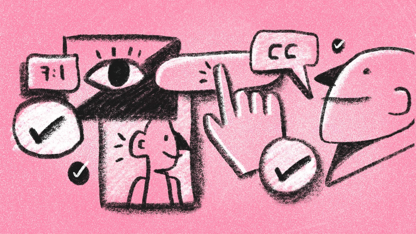
Three Web Accessibility Considerations

Articles in the Caring About Inclusivity as a Programmer Series:
- Part 1: What is Inclusive Design and Why Should I Care?
- Part 2: Three Equitable Design Considerations
- Part 3: Three Web Accessibility Considerations
Table of Contents:
- What is Web Accessibility?
- Assistive Technologies for Web Accessibility: What's out there, and how is it used?
- Accessibility Through Design: Are we working with clarity and flexibility in mind?
- Lived Experience: Are we considering the lived experiences of the people using our product or service?
- Wrapping up
What is Web Accessibility?
Web accessibility includes approaches to design and development that ensure that disabled users have equal access to and engagement with the web.1
So many fantastic web accessibility resources exist online (like UXPlanet's Primer to Web Accessibility for Designers). I know it can feel overwhelming to see how much there is to learn and to figure out where to start. In this post, I discuss three considerations that help me be a more accessibility-minded programmer.
Note: This isn't meant to be an exhaustive technical guide. We'll look at Web Accessibility through overarching lenses that can lead to further learning.
A Note on How We Talk About Disability
In this post, I use both terms "disabled person" and "people with disabilities" because a person's experience with disability is a very individual thing. Two people who technically share the same disability will have unique experiences, so it's important not to make blanket assumptions about a person's abilities and needs. Language around disability is also a very individual thing. Avoiding terms like "disabled", "deaf", or "blind" can actually reinforce disability stigma.2 When relevant and possible, it's good practice to learn what terms a person prefers and respect that preference.3
Web accessibility is typically grounded in the Social Model of disability, which frames disability as a societal and organizational problem where barriers are caused by a "lack of social organization." This is in contrast to other models like the Medical Model which focuses on disability as a personal health condition to prevent, treat, or cure.4
Assistive Technologies for Web Accessibility: What's out there, and how is it used?
When I started a career in tech, most of the accessibility resources I looked at highlighted best practices for accommodating visually impaired people or those who use screen readers. While these elements are essential components of web accessibility, learning more about the variety of tools that disabled people use on the web can provide a bigger picture. Let's take a look at some examples of the assistive tools that people with visual, auditory, and motor disabilities use.
Assistive Hardware
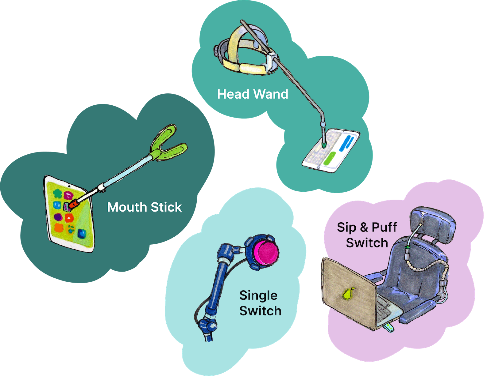
- Single-switches typically involve one large button device that people with very limited mobility use to click with other gestures (most often head movements). The clicks are interpreted by software to navigate and interact with an interface.
- Similarly, Sip-and-puff Switches interact with a user's breath to work with software to navigate and interact with an interface.
- Mouth sticks or head wands are used by people with limited or no use of their hands in order to interact with a keyboard.
- Adaptive keyboards and mouses improve UI interactions for people with limited dexterity or precision.5
Assistive Software
- Screen readers convert interfaces and contents to "synthesized speech" for blind or visually impaired users and can also work with braille converters for deaf-blind users.6
- Speech to text and voice recognition software facilitates vocal interaction and input with a UI for users with motor disabilities.7
- Transcript generating software can provide captions or transcripts for people who are deaf or hearing-impaired when human transcription is unavailable.8
- Eye-tracking software converts eye movements to interact with a UI or generate text input for people with limited or no control of hand movements and/or vocal control.9
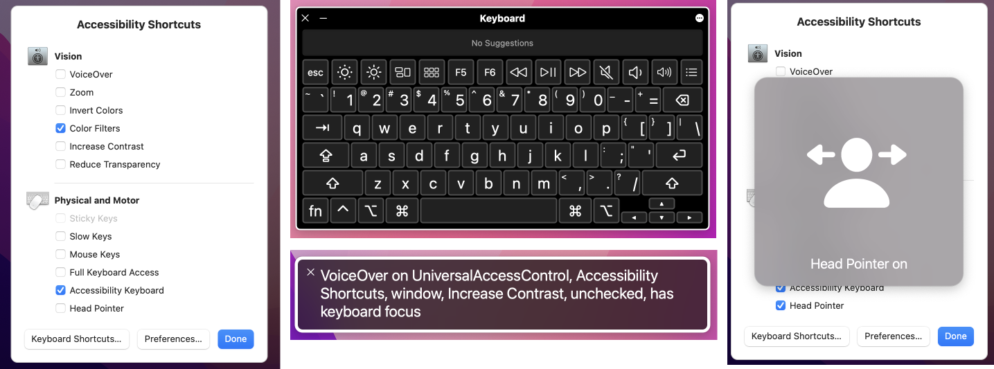 Operating systems often include several types of assistive software. Above are examples of the Accessibility options on a Macbook: an Accessibility Shortcuts menu (left), an Accessibility Keyboard (top middle), VoiceOver for screen reading (bottom middle), and a Head Pointer feature (right).
Most of these tools utilize or emulate keyboard or mouse functionality, so one key to web accessibility is to design and develop interfaces that work fully with both types of input. This includes keyboard navigability for touchscreen or mobile devices.
Testing
When building a UI to work with these technologies, testing is essential. It's good practice to test using a variety of browsers and operating systems using common tools (like JAWs for Windows and VoiceOver for Apple). Just because it's technically compliant with WCAG standards does not mean the actual user experience will be good. The only way to know is to test!
The first time I ran through a project using VoiceOver and navigating using only a keyboard, it really helped me understand how the presence or absence of accessibility considerations can make a person's experience either smooth or incredibly frustrating or impossible. Here are just two (of many) examples of what I ran into:
| Annoying or unusable component | Make it more accessible |
|---|---|
| An accordion component that used JavaScript, but didn't work with tab/enter keys. This made it inaccessible to people who navigate with the keyboard or use software that depends on tab order. | Include this element in the page's taborder. Add a keydown event to open/close the accordion panels via JavaScript. Test the focus state and keydown event in multiple browsers. |
| Decorative SVGs that, when encountered by a screen reader, were read aloud repetitively as "Unlabeled image. Unlabeled image. Unlabeled image." | Use empty alt attributes to let screen readers know these were decorative elements and could be skipped. |
You can find more great information on testing from basic UI checks to more in-depth testing by involving users on the World Wide Web Consortium (W3C) website.
Accessibility Through Design: Are we working with Clarity and Flexibility in mind?
Clear and flexible design makes the web more accessible for everybody – including people who use assistive tools and people with cognitive or neurological disabilities.
Clarity
When it comes to accessibility, clarity isn't just a nice-to-have – it's essential. Let's take a look at a few examples of how we can design and develop with clarity in mind.
Navigation & page structure: Straightforward navigation and page structures are helpful for people who use screen readers, keyboards, or switch tools to interact with a UI.
- Navigation links should be tabbable, including on mobile views, for users who rely on the keyboard or assistive technology that emulates keyboard use.
- A keyboard-only option to skip navigation links gives screen reader and keyboard users the option to go directly to a page's content without wading through a bunch of links. Below is an example of how Google implements a Skip to Main Content link. The link appears when the user first hits
tabon the keyboard.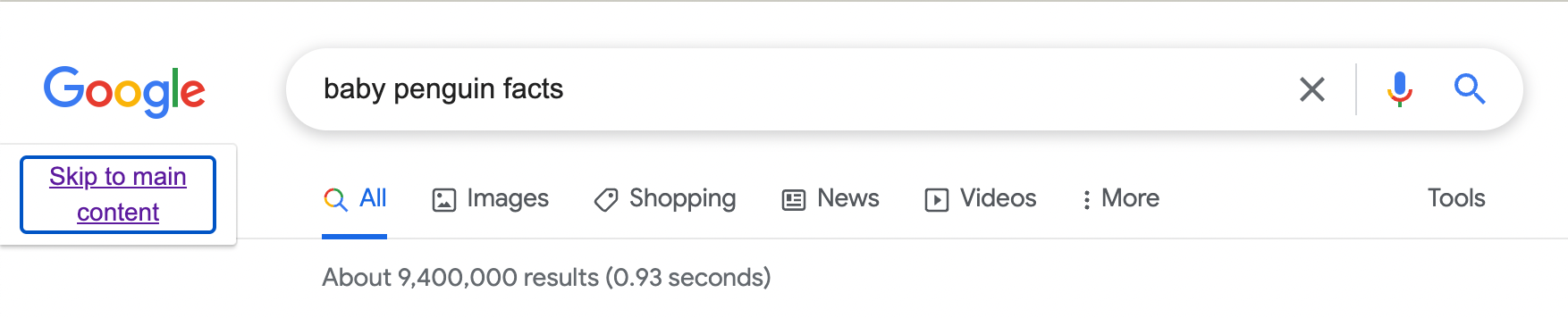
- Semantic HTML and ARIA attributes help screen readers traverse a page's structure and features.
Web content: It's good practice to consider readability for your target audience. I've seen accessibility resources recommend writing for general populations at anything from second to eighth grade reading levels.
- W3C has a more general guideline to write "as simply and clearly as is feasible" in order to accommodate a range of reading and language comprehension.
- When relevant and possible, supplemental content like illustrations or graphics are helpful for people who prefer non-text-based forms of information.
Forms and other workflows: Clarity in forms and processes is important for people with cognitive or learning disabilities and for people who use assistive technologies.
- Breaking down lengthy processes into steps can help people with attention deficits or who may need extra time to complete a task.
- Prompt user feedback like loading indicators, confirmation messages, and validation messages are also important accessibility components to people with problem-solving deficits.10 This screenshot from the American Red Cross's Blood Donor app is a great example of multiple forms of feedback: a red spinning indicator and text.
- Providing user feedback in multiple formats can make it more likely that a user will see and understand feedback. For example, error messages can be communicated using red color, an icon, a description of the error, and steps to resolve it. It's equally important to test that the error message is accessible using assistive technology:
| Validation Message Display | Make it Accessible |
|---|---|
| Page is reloaded | Indicate there's an error in the <title> tag for screen readers to prioritize |
| Single Page Application / error messages are dynamically displayed | Use the aria-live attribute so screen readers pick up on dynamic changes |
| Error is displayed in a modal using JavaScript | Ensure that the modal is operable via keyboard. |
- Clear processes and feedback also mean less redundant or corrective clicks to accomplish a task. This can translate to less fatigue for a person using a head wand or a person with hand pain or limited dexterity.
Flexibility
Adaptive Strategies are adjustments a disabled user can make to improve their experience with an interface. Because it's impossible to design a UI that perfectly fits every potential user's preferences and needs, offering and testing for flexibility gives users more control over their own experience. Let's look at a few areas where we can offer and test for flexibility.11
Text: It can be tempting to use low-contrasting font and background colors in pursuit of a slick design or to squeeze as much real estate out of a <div> as possible with tiny text, but that limits who is able to read that content.
- Visually-impaired users can use magnifying software or browser zoom features to suit their vision needs. Developers can follow guidelines for font size and contrast and test for readability using magnifying tools and zoom-in functionality in various browsers.
- For large blocks of text, providing options for line spacing or font choices can be helpful for users with dyslexia or other reading difficulties.12
Color: Certain color schemes can cause nausea, vertigo, or dizziness for people with vestibular disorders.
- Some users enable light or dark mode on their operating systems out of preference or for accessibility. Detecting these OS settings and providing appropriate alternate themes can be helpful for these users.
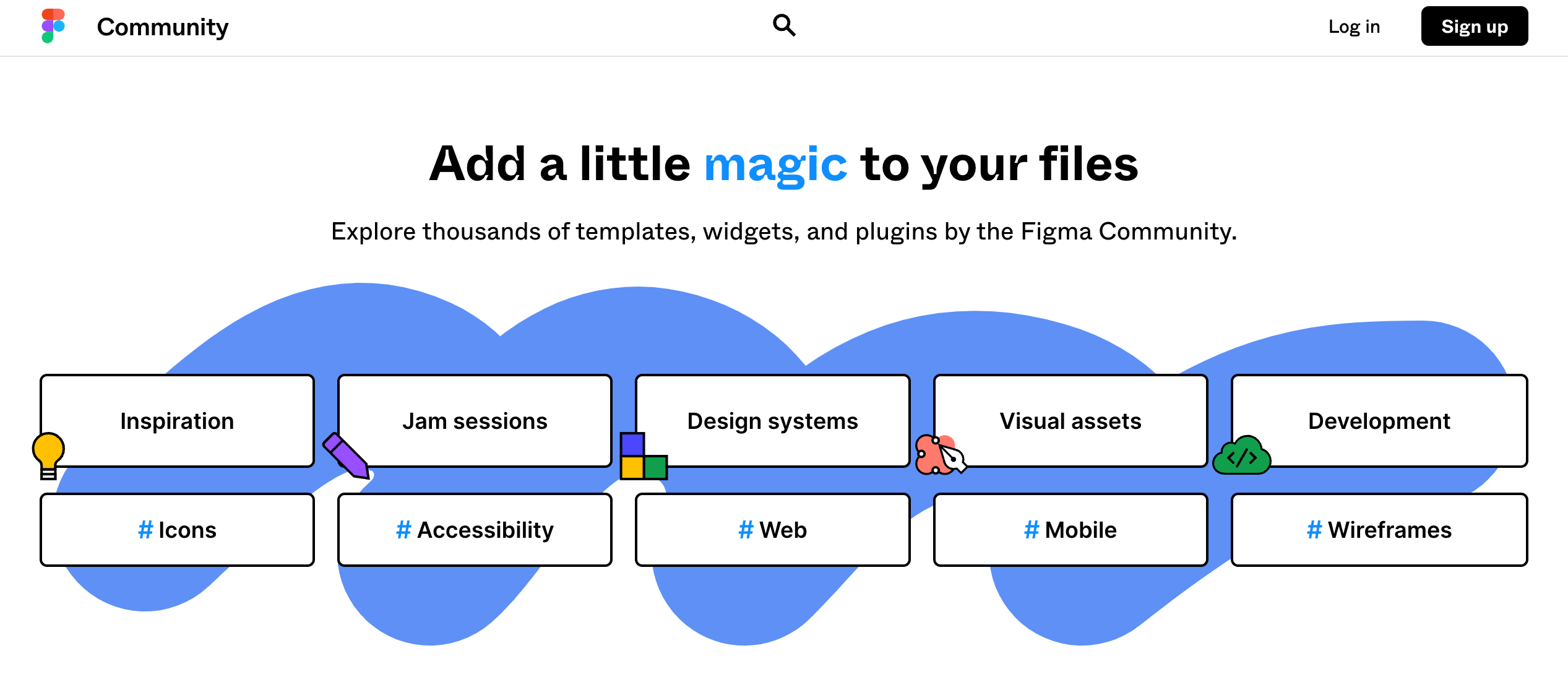
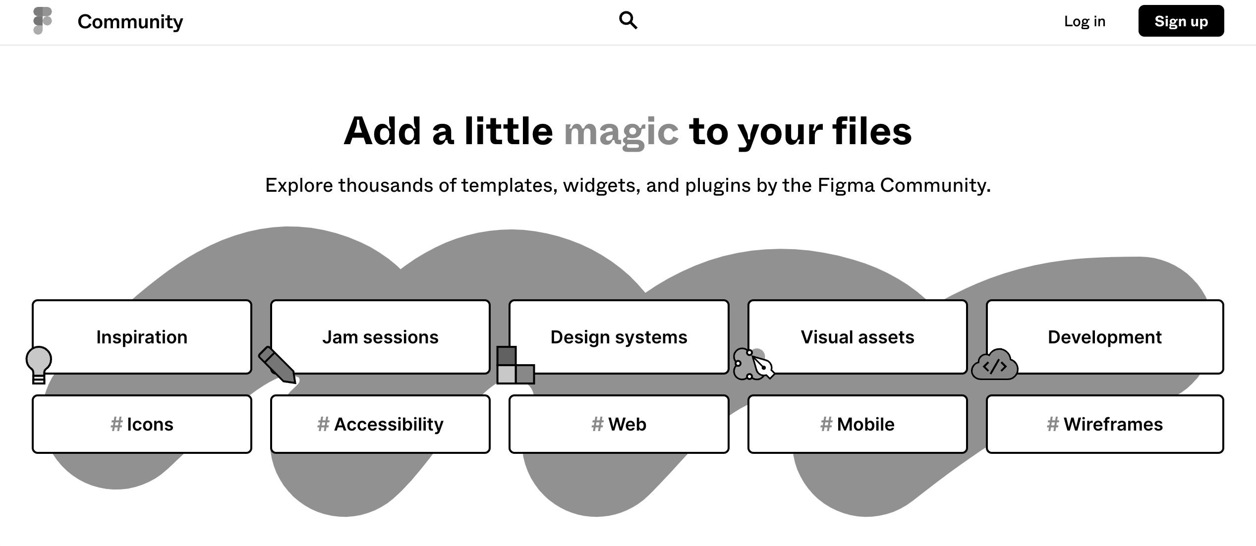
- Some users enable grayscale mode in their operating systems. Designers and developers can test that designs are readable in grayscale.
Figma's Community Widgets page is a great example of how a strong design still communicates effectively in grayscale. Below is a comparison of that page in color (top) and in grayscale (bottom).
Motion: Certain types of motion can have negative effects in people with vestibular disorders. Autoplayed or looped content can also cause distraction for those with attention-related disabilities.13
- When animation or movement is present, it's good practice to provide options for users for how they want to experience them.
Note: Strobing, flickering, or flashing graphics can trigger seizures in users with photosensitive epilepsy. It's best practice to avoid those types of graphics in general.
- When animation, sounds, or videos are present, consider if it's necessary to autoplay them.
- If autoplay is required, provide pause/play buttons (that are accessible via keyboard and mouse).
- Some users enable an operating system setting to reduce motion. Developers can leverage the CSS media feature
prefers-reduced-motionto automatically disable animations or autoplay for users with this system setting.
Lived Experience: Are we considering the lived experiences of the people using our product or service?
For these posts, I use the term "lived experience" to refer to a person's understanding of the world based on their personal experiences instead of based on a particular societal construct like philosophy, religion, or politics.
Learning about web accessibility includes learning about the lived experiences of disabled people. It's worth reiterating that even if two people technically share the same disability, their abilities, preferences, and other intersecting parts of their lived experiences will be unique to each person.
Ableism
Making blanket assumptions about disabled people is one example of ableism. People with disabilities face barriers and discrimination from systemic and individual ableism. According to the disability rights advocacy group Access Living:
"Ableism is the discrimination of and social prejudice against people with disabilities based on the belief that typical abilities are superior… [Ableism] classifies entire groups of people as 'less than,' and includes harmful stereotypes, misconceptions, and generalizations of people with disabilities."
Doing the uncomfortable work of acknowledging systemic and personal ableism is an important part of accessibility work. Access Living's Ableism 101 post is a great place to start learning about systemic and day-to-day ableism. Here are just a few examples from their post:
- Buildings that fail to comply with disability rights laws like the Americans with Disabilities Act (ADA)
- Inaccessible websites
- Assumptions that people with disabilities need or want to be "fixed"
- Not believing a person who says they are disabled because they have an invisible disability
- Considering or portraying disability to be tragic or inspirational
- Talking to a disabled person as though they're a child
Listening to Disabled Voices
Prioritizing disabled narratives is a paramount part of accessibility work. There are so many spaces where disabled people share their experiences. In this section, we'll take a look at excerpts from a couple of these spaces.
Crutches and Spice
Imani Barbarin authors the blog Crutches and Spice "from the perspective of a black woman with Cerebral Palsy." In her post If Only Your Stare Meant You Actually See Disabled People, Barbarin reflects on how abled people observe people with disabilities through a lens of ableist narratives of tragedy or triumph while doing little for furthering accessibility causes. She poses the question:
"What if, instead of calling me an inspiration, you asked yourself why it is so rare for disabled people to be seen in the spaces you frequent?"
Barbarin's post leads me to more questions about the spaces I encounter as a programmer like:
- If a company leaves the accessibility of an internal tool as an afterthought, what does that say about who they intend to hire?
- If a non-profit ignores accessibility guidelines for an intake form, what does that say about who they intend to provide their services or resources to?
- Why is it a boon instead of the norm for websites to be accessible?
Build a Ladder
Martina Sazunic is a YouTuber who primarily makes travel content. She has Ehlers-Danlos Syndrome (EDS) and shares her experiences with invisible disability, chronic pain, and depression. In her videos, Sazunic offers travel advice with accessibility in mind and describes living with chronic pain, how it impacts her mental health, and her strategy for uplifting herself that she calls: "Build a Ladder."
For Sazunic, this can mean anything from visiting a historic Japanese temple to acknowledging that washing her hair is an accomplishment because she has dislocated her shoulders so many times. She describes Build a Ladder as: "taking life step by step or rung by rung. It means appreciating every little thing you've done along the way…"
Disability Visibility
Disability Visibility: First-Person Stories from the Twenty-First Century is an anthology of writings by disabled people who share their experiences, interests, and stories about everyday life. The book is edited by Alice Wong, a "disabled activist, writer, editor, media maker, and consultant" and "the founder and director of the Disability Visibility Project."
In the book's introduction, Wong notes: "These stories do not seek to explain the meaning of disability or to inspire or elicit empathy. Rather, they show disabled people simply being in our own words, by our own accounts. Disability Visibility is also one part of a larger arc in my own story as a human being."
Policy Advocacy
While much of web accessibility is guided by the latest international Web Content Accessibility Guidelines from W3C, we can also advocate for web accessibility within our communities. W3C lists accessibility laws and policies for several countries here.
I live in the United States, which has enacted Section 508 for designing and developing technologies within accessibility guidelines for federal agencies, businesses that work with federal agencies, or organizations that receive federal funding.14 Accessibility guidelines are not enforced by law for public and private sector technologies because websites are not specified in Title III of the Americans with Disabilities Act.15 This leaves accessibility up to individual organizations and businesses - and makes it even more important for programmers to prioritize accessibility in these spaces.
I also happen to live in a Technology First U.S. state. Technology First is a category of initiatives that aim to promote independent living for people with disabilities by prioritizing the use of technology over direct support professionals when possible. Technology First states allocate government funding toward connecting disabled people with assistive technology via consultations, equipment or software rental/purchases, training, and ongoing service costs.16 Technology First is just one example of accessibility policy. As programmers, we can push for accessibility in our day-to-day projects, and we can also learn about what resources are available in our local communities and advocate for policy change where web accessibility is overlooked.
Wrapping Up
There is so much that programmers can learn about web accessibility, and I hope this post and its resources can serve as a reference point for you to start or continue learning.
Inclusivity is ultimately a team effort. With our consideration, knowledge, and efforts combined, we can work toward making the web an accessible place for everyone.
-
Introduction to Web Accessibility from the Web Accessibility Initiative, w3.org ↩︎
-
Rethinking Disability: The Social Model of Disability and Chronic Disease, Disability in Public Health ↩︎
-
Let users pause/stop/hide animation, Western Washington University ↩︎
-
Website Accessibility & the Law: Why Your Website Must Be Compliant, Search Engine Journal ↩︎
-
Putting Technology First: End the Disparity for Individuals, ANCOR ↩︎
in your inbox:
let’s talk.
Thank you!
We appreciate your interest.
We will get right back to you.